After having a look into the game 'Shadow of the Colossus' (I will post research on that later) I stumbled across the artists Chad Gowey ( http://www.chadgowey.com/) who did this amazing illustration.
I looked further into his work and found he had done a few conceptual ideas that revolved around horses which are very inspiring and can teach me a lot.
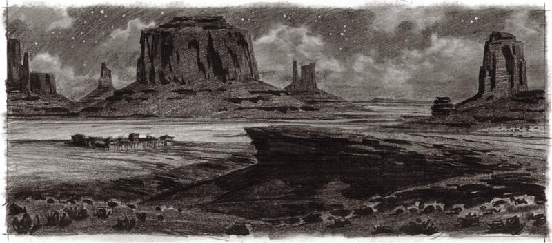
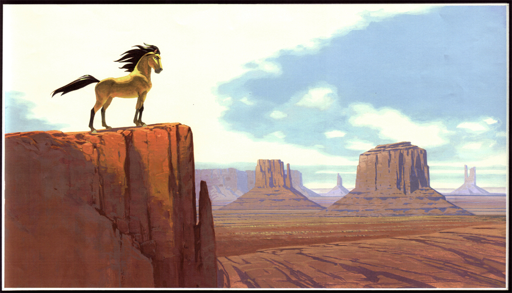
His work especially brings composition and focus points into his pieces. The tilted angle of the viewer (the 'camera angles') makes it, although feel somewhat surreal in a sense- but also more realistic as it is not just a more blunt pan down image that would be taken with a crane rig. His images are engaging as well in sense of depth, we can really see what is in the foreground, while the background recedes away from us, lacking detail but focusing strongly on form; the silhouette.
I would love to be able to achieve this with the illustrative beat boards which I will be doing for our final Game Pitch Presentation.
Chad often uses water colours for his work, and I like wise did a lot of illustrational pieces in water colours before;
These are pretty old, but they are still a good bit of work I suppose. Though the colours (especially on the first image) are very garish and bright. I think doing it via Photshop would help control the colours better.
I will do my own beat boards in Photoshop as such, though maybe do a few little sketched out scenes in water colours too!
This is one of Chad Gowey's digital illustrations (for Assassins Creed) which has more intense colours I feel then his other works, though using many of the scanned textures he had made before (very obvious in the background of the right corner).
His environmental work and character concepts are really effective as well. And Inspiring.
These are also show casing his use of angles again, and the pin point light is really successful. I will do a few studies with that in mind.
This character development work is also very valuable. But the style is a little too out of bounds of the style of the Medal of Honour themes. But the way it is developed is whats good.
Friday, 26 October 2012
Thursday, 25 October 2012
Revised Horse Colours
This is a nice bright chestnut dun with less markings. Something more plain- As suggested by some friends.
This is one asked for by Jac, a darker colour with nice white splashes like an appaloosa. And a roan colour mask. Pretty but maybe a little too 'frilly' for a war game?
A more vivid marking based on one of the markings below that were given to me by my boo.
A more extravagant colouring with some nice bit of shading as suggested by Lothar a little while back on Friday. Its nice to splash chestnut and white together.
Here is a chestnut roan with that white streak many people were attracted to. With those rump white splashes.
Here is a pile of colours and markings that me and my boo fawned over together.
Nice face marking. Socks, and stockings. Chestnut colour.
Goggle face marking on little fluffy cutie.
Half face on black- NOTE the little inside of the ear! How darling.
Pretty face marking.
The same chestnut face stripe I did above on the appaloosa.
Chestnut with an omega marking on its face.
A flat black mask. Mosk mask markings are white, a black one on white is very eye catching.
ALSO the black ear and white ear effect, awesome!
Lovely white eyelashes on a black mask. Middle of ears are black, while the outside is white.
Black back colour on grey. Note the little black mustache as well.
Brindle patterning that boo showed me, 'Catch A Bird'.
Adorable markings! Like a baby tapir. Its wearing pajamas!
Harry potter must not return to Hogwarts...
All these colours and markings are great inspiration and I am talking with Tom over what colour to finally go with.
Friday, 19 October 2012
First Horse Concepts, Shape, Colour
![]() |
| Enlarge me plz |
First looked at hundreds of horse breeds, mostly from this book -->
*Add later*
These are the main breeds I looked at, and then did extra research on to create the pictures above.
Each takes into consideration different leg, body and neck width. Also with the general look of the head- which I figured out a far better way to draw horse heads with.
*add later*
My general ability to draw horses vastly improved as well as you can see here:
*add later*
I liked the neck and head of 2 wih the legs of 18 and the back legs of 10. I think those were nice.
![]() |
| (CLICK ME TO ENLARGE!) |
Today I am asked people what colors and markings they like best and why.
Here are peoples reactions;
Wednesday, 17 October 2012
'Beat Bourds' Research- Spirit Film.
Films about Horses are not exactly rare luckily, and a famous film that focus's heavily on horse attitudes and general body language. Of course its a bit over dramatic and childish, as its a 2D animation; but all the same the look of the film was greatly researched into.
One of my favorite artists Luc Desmarchel ( http://www.ldesmarchelier.com/ ) who did extensive work to nail the look of the film.
His environmental studies and sketches are truly amazing at creating the feeling of wide open spaces. I hope to be able to show the expansive landscape of war fields in our game. Though of course ours is European areas, not of the plains.
His way of drawing horses is of course cartoony (as required) ut shows great emotion in the pose and composition.
Here are the beat boards to set the mood of scenes. I really want to do a few of these for our own project. These would be great for our presentation pitch as well to show the drama and tone for our game!
After seeing these and doing my own research, I came up with these two digital illustrations. They are of course- no where near as good. But I hope they illustrate the missions for our game well.
One of my favorite artists Luc Desmarchel ( http://www.ldesmarchelier.com/ ) who did extensive work to nail the look of the film.
His environmental studies and sketches are truly amazing at creating the feeling of wide open spaces. I hope to be able to show the expansive landscape of war fields in our game. Though of course ours is European areas, not of the plains.
His way of drawing horses is of course cartoony (as required) ut shows great emotion in the pose and composition.
![]() |
| Notice how the composition is the same but the way the characters are displayed is so different here. The flat, confined look of these horses and their riders. |
Here are the beat boards to set the mood of scenes. I really want to do a few of these for our own project. These would be great for our presentation pitch as well to show the drama and tone for our game!
After seeing these and doing my own research, I came up with these two digital illustrations. They are of course- no where near as good. But I hope they illustrate the missions for our game well.
| Foal in the Field |
| Ice Field |
Subscribe to:
Comments (Atom)


